we will be filming our music video over the weekend, on the 27th and 28th of November. as we need to get to shoot our narrative in an abandoned power station in Huncoat. this will require us to get there very early, so there is enough light for us to film as the days get much darker early on now.
we have booked the drama theater on Friday 26th and the 3rd December. we will use these times to film our performance of the band playing. in these times our music video should be complete but there is more remove for re shooting if necessary.
Monday, 29 November 2010
Thursday, 25 November 2010
costume research
I will be researching different costumes worn by rock stars to help give us an idea of what rock stars wear for our band. i will be researching many different bands from the rock genre to see if they all keep a similar style of clothing.he research will help us understand how and what rock stars wear.

As we can see from the band above "Papa roach" they have kept to the typical rock star look, wearing black clothes. it very typical to have dark hair or very long black hair. black glasses show the bands rebellious attitude.

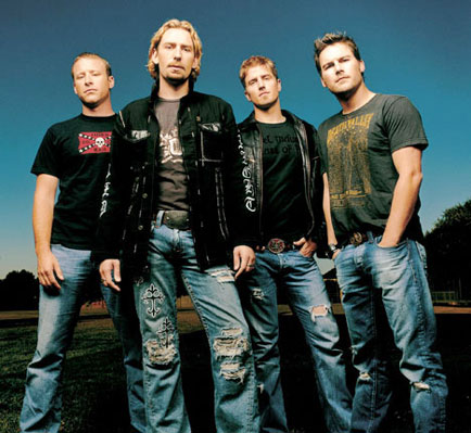
Muse have also kept to the stereotypical image of a rock star, they are dressed all in black, with white leather belts to standout. leather jackets are also common for rock star to wear as it shows there rebellious attitude. the clothes worn seem very casual not too outrageous and brightly coloured like maybe a pop star would wear.

Adam Goniter from "Three days grace" has kept the traditional look of an all black clothes, which is very typical for rock stars. he has the typical long black hair that is common in rock music. his clothes are very basic but make a strong impact compared to the background he stands out.

Kings of Leon have there rock star image, but sticking to the all black theme using white t-shirts to contrast to the black. the theme of black and white clothing seem to be continuous in all rock music. the clothes are very casual, i have noticed there is not too much effort to look perfect in as you can see they all have long black hair which is very typical for rock star the rock genre.
In my opinion the rock star image has a very typical, traditional look of wearing black clothes such as shirts, t-shirts and leather jackets. the rock image is open to many different styles the only aspect of rock clothes that stay the same is black clothing or white clothes to stand out among the black. we have decided to uses two costumes for our video one with the majority of our clothes black and the other costume to be brighter, more white clothing to show the difference of us,it will make our clothes stand out more if Theres a dramatic colour change. we are choosing to use black clothes for our narrative to reflect on the nightmare of the narrative, and will work well with the creepy, gritty location. this idea of black then white clothing was inspired by the avenged sevenfold video - afterlife.
As we can see from the band above "Papa roach" they have kept to the typical rock star look, wearing black clothes. it very typical to have dark hair or very long black hair. black glasses show the bands rebellious attitude.
Muse have also kept to the stereotypical image of a rock star, they are dressed all in black, with white leather belts to standout. leather jackets are also common for rock star to wear as it shows there rebellious attitude. the clothes worn seem very casual not too outrageous and brightly coloured like maybe a pop star would wear.
Adam Goniter from "Three days grace" has kept the traditional look of an all black clothes, which is very typical for rock stars. he has the typical long black hair that is common in rock music. his clothes are very basic but make a strong impact compared to the background he stands out.
In my opinion the rock star image has a very typical, traditional look of wearing black clothes such as shirts, t-shirts and leather jackets. the rock image is open to many different styles the only aspect of rock clothes that stay the same is black clothing or white clothes to stand out among the black. we have decided to uses two costumes for our video one with the majority of our clothes black and the other costume to be brighter, more white clothing to show the difference of us,it will make our clothes stand out more if Theres a dramatic colour change. we are choosing to use black clothes for our narrative to reflect on the nightmare of the narrative, and will work well with the creepy, gritty location. this idea of black then white clothing was inspired by the avenged sevenfold video - afterlife.
Song Lyrics
i wont let you down
i wont let you down
i wont let you down (scream - with "Down" + next line)
i wont let you down
i wont let you down.
if i fall asleep tonight
i'll dream of somthing better
when it comes to life
you live without regrets
(woah, woah, woah, ^woah, woah, woah, woah, ^woah, woah)
So tell me what
(tell me what - on prev. "What")
did you expect
you'd better check your expectations (scream - (Expectations) simaltaniously)
theres not much left
for you to take
i've given up
what i have wanted
i'm letting go of you tonight
(i'm letting go)
of you toni-i-i-ight
so dont look back
if i fall asleep tonight
i'll dream of somthing better
when it comes to life
you live without regrets
(woah, woah, woah, ^woah, woah, woah, woah, ^woah, woah)
(i know, i know
i let you run my life
I ???? for you)
you always said this couldn't last forever
must have known right from the start
you must have wanted this some how
well i wouldnt want to disapoint you
we could blame it all on fate
i wont let you down
i wont let you down
i wont let you down (scream - with "Down" + next line)
i wont let you down
(Scream)i wont let you down
if i fall asleep tonight
i'll dream of somthing better
when it comes to life
you live without regrets
i wont let you down
i wont let you down (scream - with "Down" + next line)
i wont let you down
i wont let you down.
if i fall asleep tonight
i'll dream of somthing better
when it comes to life
you live without regrets
(woah, woah, woah, ^woah, woah, woah, woah, ^woah, woah)
So tell me what
(tell me what - on prev. "What")
did you expect
you'd better check your expectations (scream - (Expectations) simaltaniously)
theres not much left
for you to take
i've given up
what i have wanted
i'm letting go of you tonight
(i'm letting go)
of you toni-i-i-ight
so dont look back
if i fall asleep tonight
i'll dream of somthing better
when it comes to life
you live without regrets
(woah, woah, woah, ^woah, woah, woah, woah, ^woah, woah)
(i know, i know
i let you run my life
I ???? for you)
you always said this couldn't last forever
must have known right from the start
you must have wanted this some how
well i wouldnt want to disapoint you
we could blame it all on fate
i wont let you down
i wont let you down
i wont let you down (scream - with "Down" + next line)
i wont let you down
(Scream)i wont let you down
if i fall asleep tonight
i'll dream of somthing better
when it comes to life
you live without regrets
Wednesday, 24 November 2010
album advertisments research

this album advertisement has a bold eye caughting title "worth the weight" which is a pun on the albums title gravity. the advertisement is very basic using black and white colour scheme. there is a small paragraph about the band and there new album to interest readers on who the band is for unfamiliar people. a picture of there album cover so it is recognisable in the shops. nothing fancy has been used in this advert is its very simple but useful to clearly see the album, the name of the band and when its released.

this album advert also has a simple layout, it clearly displays the bands name/logo is white bold lettering on a black background it is stands out to grab your attention. for fans of the band this logo is well known and would instantly interested into what it is advertising. the dates are clearly shown so is the website to get in contact to buy the album. the black and white bold letter are what makes this advertisement with it recognisable font, it clearly does a good job to attract attention.

this album advert play up to the rock image, sticking to the colour theme of white and black, which seem to be popular, for bands to do this, they have also added red. these colours have been choose because they reflect the bands dark aggressive music.the image used plays up to the "sex, drugs and rock n roll" image. the photo used is someone injecting themselves with a drug, this is showing there crazy, rebel attitude. the font used has a hunting theme to it showing the band plays dark angry music.

once again a black and white colour scheme to stand out. the band have gone for a simple big white letters displaying the bands name "the stone roses" the information for buying the "sally cinnamon" song is clearly displayed. although you don't get a feel for the bands sound or image the advert is very effective to get them selves know. fans familiar with the band will be clearly drawn to this advert, it is unmissable to not see this advert. with in a quick glance you can easily get the information you need to know such as band, date release, song.
In our opinion we beleive a bold font will help the magazine advert be much more appealing, from our research the best adverts in our opinion are the one that have very bold fonts
Tuesday, 23 November 2010
digipak research
digipak is a style of CD packaging made up of six or more sides. there are usually a booklet or extra disc than just the standard CD packaging. the digipak follows the brand identity using concept art through out to give a feel of the band an album.
digipak themes

as we can see from the oasis digipak, they have kept to imagery reflecting to the music of the album. the album is oasis acoustic so there is a picture of a acoustic guitar. the colour theme is wood colours, using many light brown, such as the floor and the guitar.

Judas priest have a different style of the layout to a digipak, they have three holders for discs and have a clear theme. there metal, silver and black logo is also used on the disc as well to build this theme. we can tell from the front cover the genre of music. with blood at the bottom of the logo and such a strong, bold logo it is clear a rock album digipak

a clear brand identity of black and red themes, using Gothic imagery such as a graveyard and a cross, these are very typical in the Gothic genre to use scary concept art as there theme for the album. we can see they have kept the theme throughout even to the discs colouring one in bright red and to contrast another disc in black.


this digipak has used a simple theme that stands out. they have used a pink/white line on t a black background, so it stands out and is very recognisable. when the digipak is unfolded the theme continues with two sides at either side of the disc holder.
digipak layout

this digipak layout is the most common style i have found from my research, having one disc holder and five other sides to put song listings, bands pictures, book holder etc there is plenty of room to fit various pictures of the band and concept art to create a strong appealing theme for our bands digipak

this digipak is a simple design having two slides on the left side to unfold, this is a much smaller digipak this would not give us as much creativity to use with concept art
digipak themes
as we can see from the oasis digipak, they have kept to imagery reflecting to the music of the album. the album is oasis acoustic so there is a picture of a acoustic guitar. the colour theme is wood colours, using many light brown, such as the floor and the guitar.
Judas priest have a different style of the layout to a digipak, they have three holders for discs and have a clear theme. there metal, silver and black logo is also used on the disc as well to build this theme. we can tell from the front cover the genre of music. with blood at the bottom of the logo and such a strong, bold logo it is clear a rock album digipak
a clear brand identity of black and red themes, using Gothic imagery such as a graveyard and a cross, these are very typical in the Gothic genre to use scary concept art as there theme for the album. we can see they have kept the theme throughout even to the discs colouring one in bright red and to contrast another disc in black.
this digipak has used a simple theme that stands out. they have used a pink/white line on t a black background, so it stands out and is very recognisable. when the digipak is unfolded the theme continues with two sides at either side of the disc holder.
digipak layout
this digipak layout is the most common style i have found from my research, having one disc holder and five other sides to put song listings, bands pictures, book holder etc there is plenty of room to fit various pictures of the band and concept art to create a strong appealing theme for our bands digipak
this digipak is a simple design having two slides on the left side to unfold, this is a much smaller digipak this would not give us as much creativity to use with concept art
Friday, 19 November 2010
technology and equipment
we will be using various equipment and technology to create our film, digi pack and magazine album cover.
technology and equipment we will use to create our film
video camera


slide-share

Microsoft publisher


final cut express

technology and equipment we will use to create our film
video camera
digital camera
tripod
technology we will be using to create our digi packs and magazine album cover
Microsoft word
slide-share
Microsoft publisher
adobe photoshop
final cut express
Props List
Masks x 4
Guitar x 2
Bass Guitar x 1
Drums + Drum Sticks x 1
Microphone x 1
Amps +Wires x 3
Guitar x 2
Bass Guitar x 1
Drums + Drum Sticks x 1
Microphone x 1
Amps +Wires x 3
Monday, 15 November 2010
Feedback 15.11.10
Lads, I know you have ben working hard this week planning and filming, however, there is no evidence of this on the blog. You must update this regularly even during production to show how much work you are producing.
I know you will have fooftage to edit this week but you can take turns on this and completing the research and planning for each of the ancillary tasks. You must all contribute to each task equally. You only really need one piece of research and one piece of planning for each task (digipack album and mag advert for release of album).
I am not in tomorrow, however, the lesson will still go ahead. You need to get Mike to let you in the room and he will be on hand should you ge stuck with anything. Please carry on and complete any outstanding research and planning in your own time and during the workshops this week. You only have 5 weeks left to complete all the work.
Mrs A
Wednesday, 10 November 2010
Green Screen Training
This is our green screen training, it is very helpful as we hope to be using green screening in our video.
We had allot of inspiration from this video due to how abstract it its. There are many random occurrences and much self conflict, a theme we hoping to portray through our video.
The narrative for this video is very unclear yet you can clearly see whats happening, which is quite enigmatic, which we hope to capture.
This second video is also enigmatic as to what exactly the narrative is. however this is also a good example of how body language can be used for expression as apposed to someone's facial expression, which is what we need seen as we are wearing masks.
In this video it is the same band as above (Fact) but in this video they expel their masks. Yet throughout the entire video we still don't see their faces, they achieve this through backlighting and shots of just their chins. Etc.
BRAND IDENTITY
Brand identity new
View more presentations from L3WIS.
Monday, 8 November 2010
Feedback 8.11.10
Alex, Alix and Lewis,
You have not made much progress in the last week according to your blog. You should have completed all your research and planning by now. Your research is not complete - where are the results and analysis of your questionnaires? Who is your audience and what have you learnt from them that you can incorporate into the project?
I like the idea for the masks. Just becareful that you are doing something different with them! You must still have a USP. There are lots of different types of masks that you can customise available at Hobbycraft for approx £3 each if that helps!
In your posts where you have referred to other videos and provided a link, please go back and try to embed the Youtube video properly. You need to make sure that you are on 'Edit HTML' when you post rather than 'Compose'.
I need to see evidence of your planning. You need to include storyboards, casting and location shots, completed costumes, props etc. You need to book studios, rooms etc so don't leave this until last minute. I am getting worried by the absence of these things at this stage in the coursework. You need to get this work complete so that you have maximum time to focus your efforts on production.
Any issues, questions etc, then see me.
Mrs Abell
Sunday, 7 November 2010
conventions of music video/ ancillary tasks


such as yellow or red.
as we can see from these images above, the theme of black clothing is used with either jeans or black pants. we have decided to dress in black cloth to stick to the traditional dark clothing

BAND LOGO
logos are very popular in music and help set a brand identity we will be researching diffrent logos to see how they give a brand identity and how they look.

A simple logo that clearly displays there name "Led Zepplin" in big front with there signture logo font. using black and white the title stands out very clear and is very effective.

Metallicas Logo is a traditonal one, there name in a signture font that refelcts the fast pace metal music becuase of its sharp edges and is coloured the same as metal a very recognisable logo.
 Paramores brand new eyes logo, using butterfly wings they have kept a close link with there album civer, and you can see a clear brand identity. also the logo has been done in black and white to stand out.
 Glassjaw have a simialer logo to clothes, using initals, the G and J have been joined up as one a very clever and inventive logo, that is much diffrent to other logos. although they have kept the the traditonal and popular black and white colour scheme.
 pendulum has a very intresting logo easily recognisable and unique. A very colourful logo, it is very diffrent to many other logos, using crop circle like patterns to give it a strange design.the logo fits very well in there video too, as they feature crop circles, aliens etc with the electro/rock music.
Tuesday, 2 November 2010
Identifying The Target Audience
Target Audience Questionnaire:
This is the questionnaire Designed to locate and identify our target audience, it asks a variety of questions that will give us a good insight to who thy are.
We do this via "GRASS" and through use of "AIDA" in the questions and following will be graphs and pie-charts to give a clear representation of who the audience are and what they expect from us.
We have asked:
Gender
Race
Age and
Socio-Economic
Status.
Our target audience is a majoritivty male and niche.
Monday, 1 November 2010
Feedback 1.11.10
Alex, Alix and Lewis,
You have made a reasonable start to this project, however, youa re considerably behind where you should be and you have done very little work in your own time. This is ongoing homework and you should be posting regularly.
Your posts all need more detail in general. You need to include the actual videos that you are analysing in your posts. You should each be analysing one video in detail. I need to see some use of media language terminology - say how certain represetnations etc are constructed.
You need to spend extra time this week in the workshops to catch up. By next week you should be filming your video. Please see the checklist for details of the work you still need to complete. See me if you have any problems/questions.
Mrs A
Subscribe to:
Comments (Atom)